CLIENT —
Fort Lee Girls Recreational League President
CREATIVE DIRECTION —
Logo rebrand and create a new visual identity
OBJECTIVE —
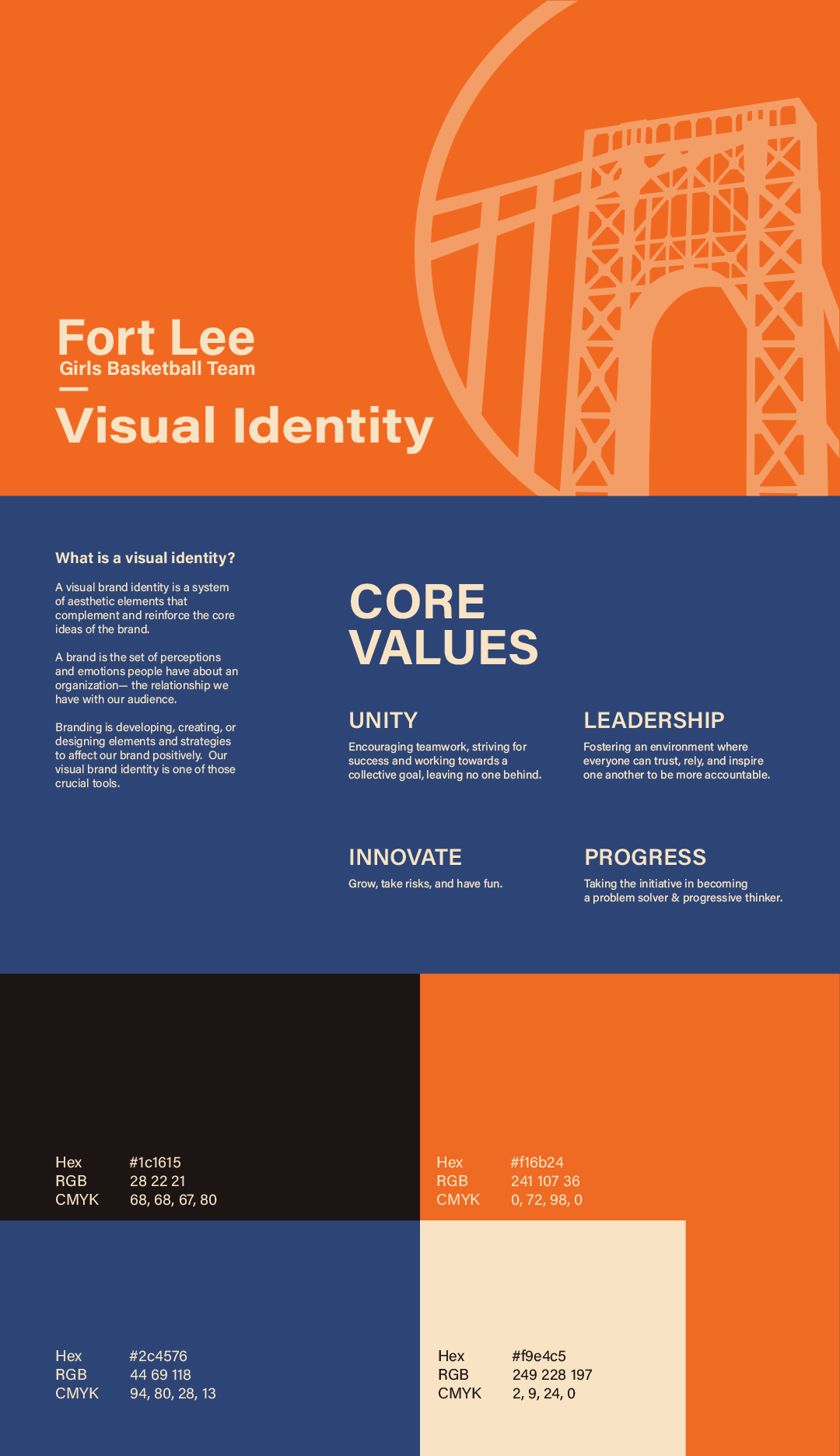
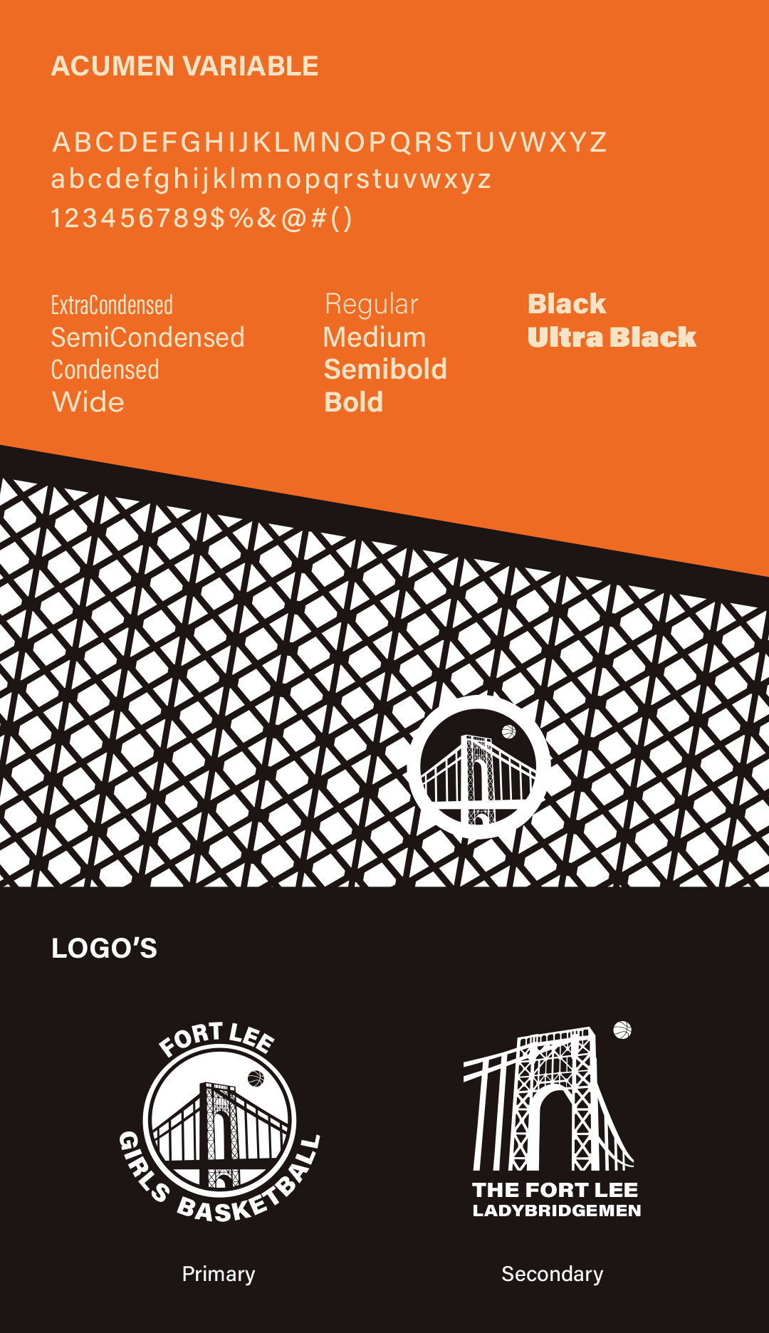
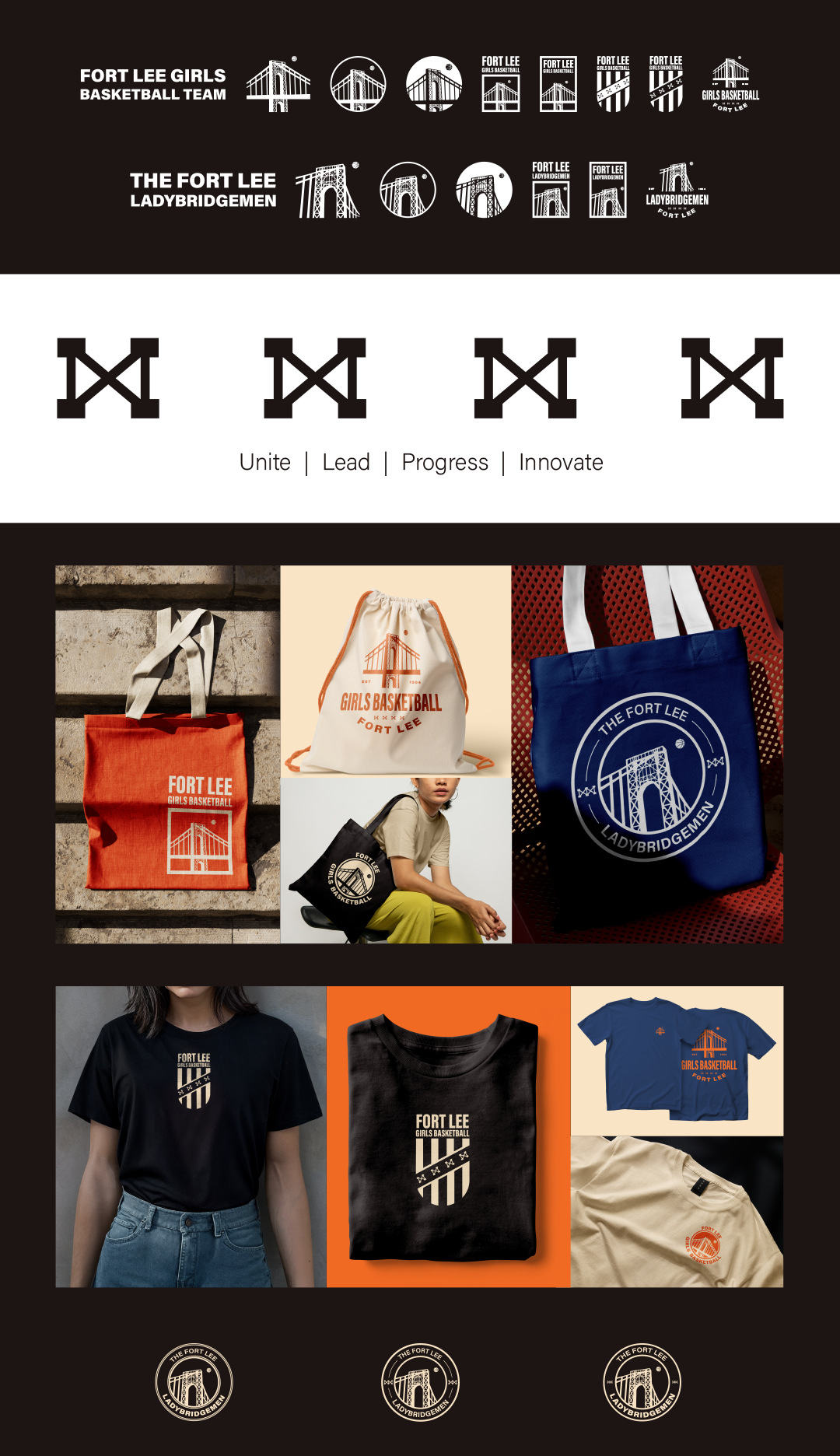
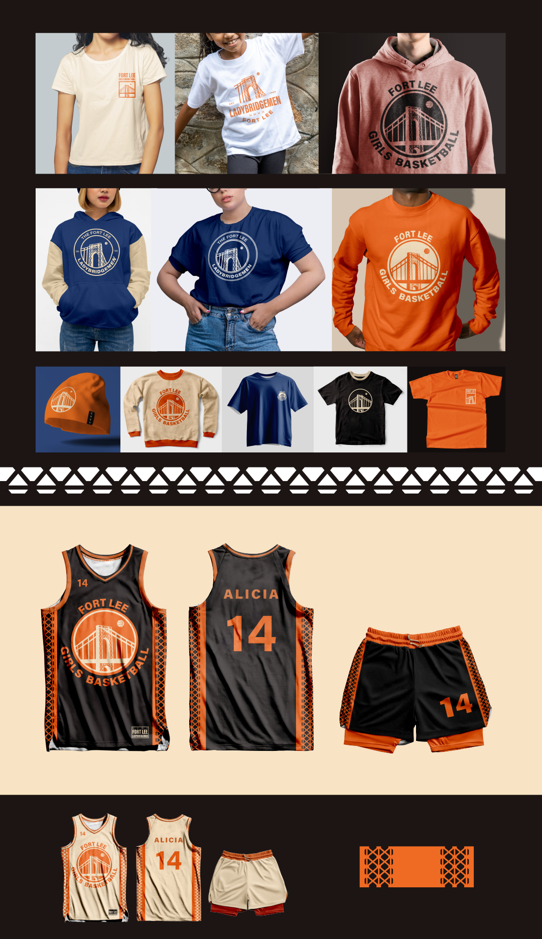
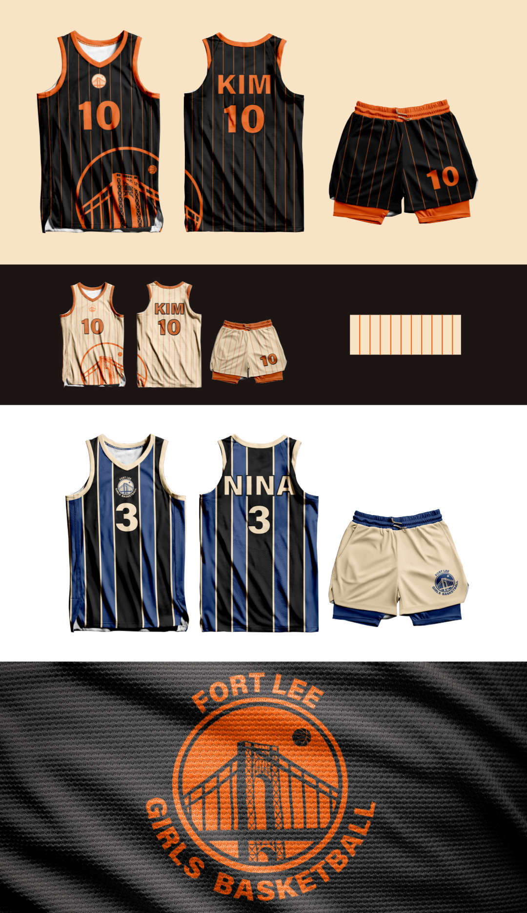
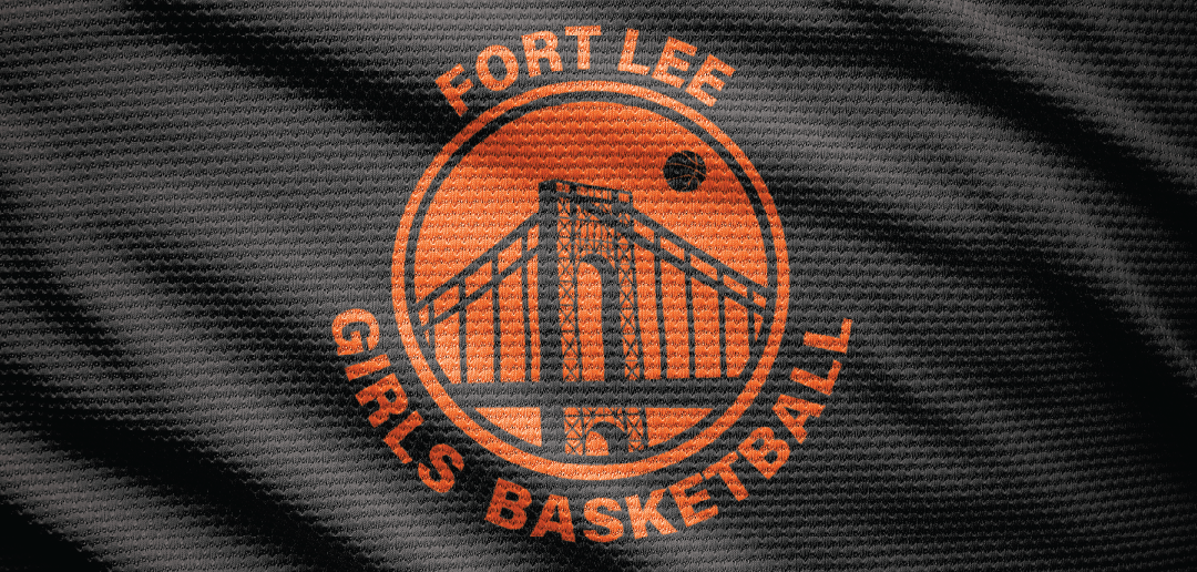
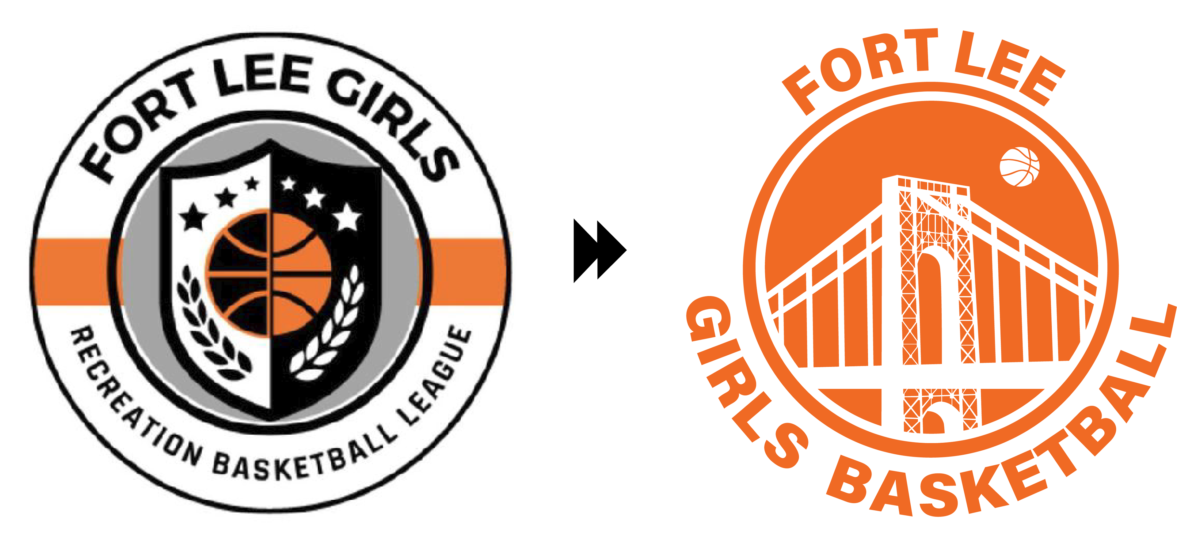
Create a logo that used the George Washington bridge as an emblem for Fort Lee. I designed the logo to be interchangeable for most other recreational sports teams in town if needed, the bridge is a strong marker.
What started as a simple request for a logo redesign turned into a brand guideline, and establishing what it would mean to have a visual identity then executing it.
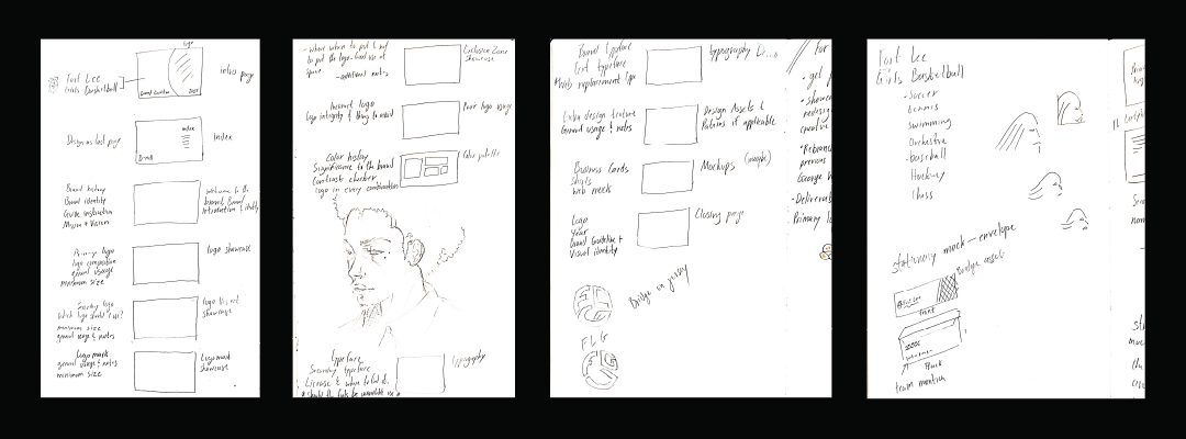
Brand guideline notes on how much information is essential for an organization that doesn't have an in-house designer. I kept in mind that this was basically for a community center, so I didn't need to create a 160 page brand guideline on every iota of the leagues fabric and identity.
I kept it simple and easy to understand, in turn making it easy to implement.
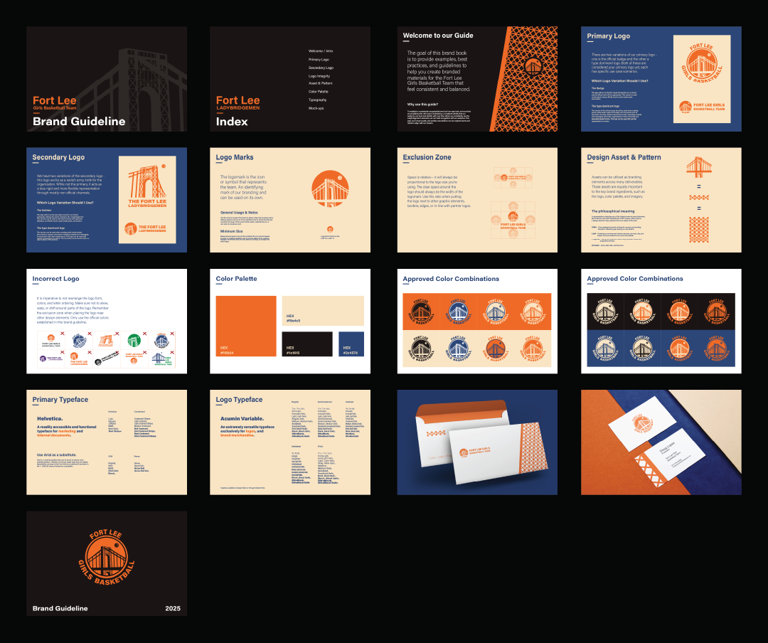
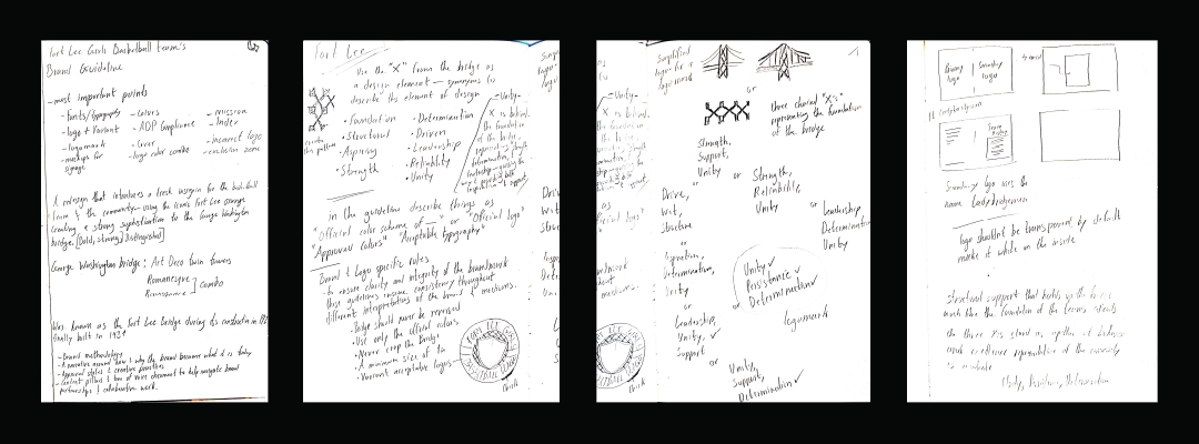
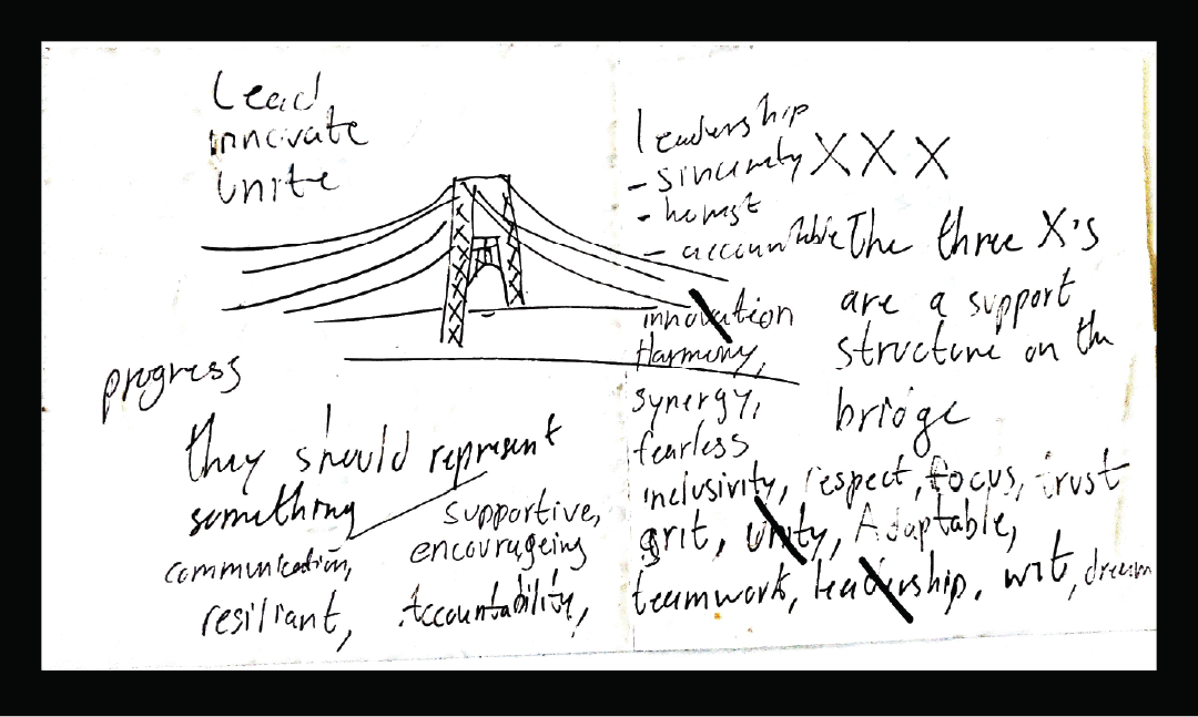
Notes and research on Fort Lee, the bridge and coming up with visual identifiers such as the pillars, turning them into a symbolic ethos for the team. 4 pillars were used to be defined as the teams mantra of: Unity, Leadership, Progress, and Innovation
.